World GNI
Global GNI
GNI (formerly GNP)
Is the sum of value added by all resident producers plus any product taxes (less subsidies) not included in the valuation of output plus net receipts of primary income (compensation of employees and property income) from abroad.
All data are in current U.S. dollars.
Source
All data is from the World Bank and uses a Creative Commons licence. Current at 2021-06-27. Data is found here:
https://databank.worldbank.org/reports.aspx?source=2&series=NY.GNP.PCAP.CD&country=
Load the Data
Read the raw data from World Bank. We replace .. with NA as this is easier to work with in R and remove Series Name and Series Code columns, as we will not need these.
gni_raw <- read_csv(
  "../data/global_gni.csv",
  na = c("..")
) %>%
  select(-`Series Name`, -`Series Code`)

str(gni_raw)
## tibble [269 x 52] (S3: tbl_df/tbl/data.frame)
## $ Country Name : chr [1:269] "Afghanistan" "Albania" "Algeria" "American Samoa" ...
## $ Country Code : chr [1:269] "AFG" "ALB" "DZA" "ASM" ...
## $ 1971 [YR1971]: num [1:269] 1.87e+09 NA 5.04e+09 NA NA ...
## $ 1972 [YR1972]: num [1:269] 1.63e+09 NA 6.74e+09 NA NA ...
## $ 1973 [YR1973]: num [1:269] 1.77e+09 NA 8.64e+09 7.56e+07 NA ...
## $ 1974 [YR1974]: num [1:269] 2.20e+09 NA 1.31e+10 7.70e+07 NA ...
## $ 1975 [YR1975]: num [1:269] 2.42e+09 NA 1.54e+10 6.77e+07 NA ...
## $ 1976 [YR1976]: num [1:269] 2.61e+09 NA 1.74e+10 6.85e+07 NA ...
## $ 1977 [YR1977]: num [1:269] 3.02e+09 NA 1.98e+10 7.92e+07 NA ...
## $ 1978 [YR1978]: num [1:269] 3.37e+09 NA 2.51e+10 8.47e+07 NA ...
## $ 1979 [YR1979]: num [1:269] 3.78e+09 NA 3.15e+10 1.06e+08 NA ...
## $ 1980 [YR1980]: num [1:269] 3.72e+09 NA 4.05e+10 1.27e+08 NA ...
## $ 1981 [YR1981]: num [1:269] 3.55e+09 NA 4.23e+10 1.39e+08 NA ...
## $ 1982 [YR1982]: num [1:269] NA NA 4.32e+10 1.51e+08 NA ...
## $ 1983 [YR1983]: num [1:269] NA NA 4.70e+10 1.66e+08 NA ...
## $ 1984 [YR1984]: num [1:269] NA 1.86e+09 5.20e+10 1.78e+08 NA ...
## $ 1985 [YR1985]: num [1:269] NA 1.90e+09 5.64e+10 1.90e+08 NA ...
## $ 1986 [YR1986]: num [1:269] NA 2.1e+09 6.2e+10 NA NA ...
## $ 1987 [YR1987]: num [1:269] NA 2.08e+09 6.48e+10 NA NA ...
## $ 1988 [YR1988]: num [1:269] NA 2.05e+09 5.66e+10 NA NA ...
## $ 1989 [YR1989]: num [1:269] NA 2.25e+09 5.36e+10 NA NA ...
## $ 1990 [YR1990]: num [1:269] NA 2.03e+09 5.98e+10 NA NA ...
## $ 1991 [YR1991]: num [1:269] NA 1.08e+09 4.32e+10 NA NA ...
## $ 1992 [YR1992]: num [1:269] NA 6.17e+08 4.58e+10 NA NA ...
## $ 1993 [YR1993]: num [1:269] NA 1.22e+09 4.82e+10 NA NA ...
## $ 1994 [YR1994]: num [1:269] NA 1.89e+09 4.08e+10 NA NA ...
## $ 1995 [YR1995]: num [1:269] NA 2.44e+09 3.96e+10 NA NA ...
## $ 1996 [YR1996]: num [1:269] NA 3.27e+09 4.44e+10 NA NA ...
## $ 1997 [YR1997]: num [1:269] NA 2.31e+09 4.60e+10 NA NA ...
## $ 1998 [YR1998]: num [1:269] NA 2.62e+09 4.62e+10 NA NA ...
## $ 1999 [YR1999]: num [1:269] NA 3.29e+09 4.64e+10 NA NA ...
## $ 2000 [YR2000]: num [1:269] NA 3.59e+09 5.21e+10 NA NA ...
## $ 2001 [YR2001]: num [1:269] NA 4.07e+09 5.31e+10 NA NA ...
## $ 2002 [YR2002]: num [1:269] NA 4.48e+09 5.45e+10 NA NA ...
## $ 2003 [YR2003]: num [1:269] NA 5.78e+09 6.52e+10 NA NA ...
## $ 2004 [YR2004]: num [1:269] NA 7.36e+09 8.17e+10 NA NA ...
## $ 2005 [YR2005]: num [1:269] NA 8.23e+09 9.81e+10 NA NA ...
## $ 2006 [YR2006]: num [1:269] NA 9.16e+09 1.12e+11 NA NA ...
## $ 2007 [YR2007]: num [1:269] NA 1.10e+10 1.33e+11 NA NA ...
## $ 2008 [YR2008]: num [1:269] NA 1.29e+10 1.70e+11 NA NA ...
## $ 2009 [YR2009]: num [1:269] 1.24e+10 1.19e+10 1.36e+11 NA NA ...
## $ 2010 [YR2010]: num [1:269] 1.59e+10 1.18e+10 1.61e+11 NA NA ...
## $ 2011 [YR2011]: num [1:269] 1.78e+10 1.29e+10 1.98e+11 NA NA ...
## $ 2012 [YR2012]: num [1:269] 2.00e+10 1.22e+10 2.05e+11 NA NA ...
## $ 2013 [YR2013]: num [1:269] 2.06e+10 1.30e+10 2.05e+11 NA NA ...
## $ 2014 [YR2014]: num [1:269] 2.05e+10 1.34e+10 2.09e+11 NA NA ...
## $ 2015 [YR2015]: num [1:269] 2.01e+10 1.15e+10 1.62e+11 NA NA ...
## $ 2016 [YR2016]: num [1:269] 1.82e+10 1.21e+10 1.58e+11 NA NA ...
## $ 2017 [YR2017]: num [1:269] 1.91e+10 1.31e+10 1.68e+11 NA NA ...
## $ 2018 [YR2018]: num [1:269] 1.85e+10 1.51e+10 1.71e+11 NA NA ...
## $ 2019 [YR2019]: num [1:269] 1.96e+10 1.51e+10 1.67e+11 NA NA ...
## $ 2020 [YR2020]: logi [1:269] NA NA NA NA NA NA ...We see from the str() that this data is in a wide format, with ‘strange’ year column names.
Tidy the Data
To work best in R, we should use a long table format - giving one observation per row.
Here, we:
- rename the
nnnn [YRnnnn]columns tonnnn - remove all spaces in column names
- pivot the data to create
yearand gnivaluescolumns, each row having one one year per country
# prefix first 4 digits with `y`; remove ` [YRdddd]`
# remove ` `
gni <- gni_raw %>%
  rename_with(~ sub("(^\\d{4}).*$", "\\1", .x)) %>%
  rename_with(~ sub("\\s", "", .x))

gni <- gni %>%
  pivot_longer(matches("\\d{4}"), names_to = "year", values_to = "gni")

str(gni)
## tibble [13,450 x 4] (S3: tbl_df/tbl/data.frame)
## $ CountryName: chr [1:13450] "Afghanistan" "Afghanistan" "Afghanistan" "Afghanistan" ...
## $ CountryCode: chr [1:13450] "AFG" "AFG" "AFG" "AFG" ...
## $ year : chr [1:13450] "1971" "1972" "1973" "1974" ...
## $ gni : num [1:13450] 1.87e+09 1.63e+09 1.77e+09 2.20e+09 2.42e+09 ...Select Countries
We’re not doing anything major here, just being curious, so just work with a few countries.
countries <- c(
  "GBR", "USA", "NZL", "AUS", "DEU", "CHN", "JPN", "CAN", "WLD"
)
Plot GNI Data
A plot of GNI in current United States Dollars (USD).
gni %>%
  filter(CountryCode %in% countries) %>%
  mutate(bln = gni / 1000000000) %>%
  ggplot(aes(year, bln, group = CountryCode, colour = CountryCode)) +
  geom_vline(xintercept = "2008", colour = "red3", size = 0.1) +
  geom_line(stat = "identity") +
  geom_point() +
  geom_smooth(method = "loess") +
  facet_wrap(~CountryName, scales = "free") +
  scale_x_discrete(breaks = seq(1971, 2021, 10)) +
  scale_y_continuous(expand = c(0, 0), labels = label_comma()) +
  labs(
    title = "GNI Actual Values between 1971 and 2000",
    subtitle = "current USD, billions (1e+9)",
    x = "Year",
    y = "Value (billion USD)",
    caption = "vertical line marks the 2008 'financial crisis'"
  ) +
  theme(legend.position = "none")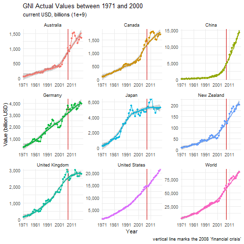
The vertical line represents the year 2008, when the “global financial crisis” occurred.
It is interesting to see that it actually helped Japan and (apart from a quick, small fall) Australia.
The United Kingdom fared the worse, but appears to have been in decline before the event.
The United States only flattened out.
Zooming out to the World data, there clearly is a dip in GNI, but also in approx. 2015 which can also be seen in the chosen country charts.
Percentage Change
Perhaps a “fairer” approach for comparison, is to compare the percentage increase since the first observed year.
This code will select the minimum year and create a new column (first) containing that data for each country.
first_observation <- gni %>%
  drop_na() %>%
  arrange(CountryCode, year) %>%
  group_by(CountryCode) %>%
  slice_min(year) %>%
  rename(first = gni)
Join our first observation data to the original GNI data.
Also create a percent column which takes each GNI observation and creates a percentage increase since the first observation…
gni_pct <- gni %>%
  left_join(
    select(first_observation, CountryCode, first),
    by = "CountryCode"
  ) %>%
  drop_na() %>%
  mutate(percent = (gni - first) / first * 100)

head(gni_pct)
## # A tibble: 6 x 6
## CountryName CountryCode year gni first percent
## <chr> <chr> <chr> <dbl> <dbl> <dbl>
## 1 Afghanistan AFG 1971 1868886653. 1868886653. 0
## 2 Afghanistan AFG 1972 1631108938. 1868886653. -12.7
## 3 Afghanistan AFG 1973 1771108944. 1868886653. -5.23
## 4 Afghanistan AFG 1974 2202222229. 1868886653. 17.8
## 5 Afghanistan AFG 1975 2417777778. 1868886653. 29.4
## 6 Afghanistan AFG 1976 2611111162. 1868886653. 39.7… and plot.
gni_pct %>%
  filter(CountryCode %in% countries) %>%
  ggplot(aes(year, percent, group = CountryCode, colour = CountryCode)) +
  geom_vline(xintercept = "2008", colour = "red3", size = 0.1) +
  geom_line(stat = "identity") +
  geom_point() +
  geom_smooth(method = "loess") +
  facet_wrap(~CountryName, scales = "free") +
  scale_x_discrete(breaks = seq(1971, 2021, 10)) +
  #  scale_y_log10() +
  labs(
    title = "GNI Percentage increase since 1971",
    subsitle = "percent increase in GNI, since the previous year",
    x = "Year",
    y = "Percent Increase (log10)",
    caption = "vertical line marks the 2008 'financial crisis'"
  ) +
  theme(legend.position = "none")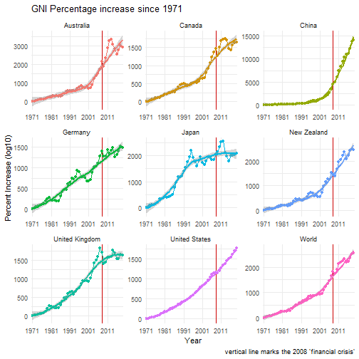
This now clearly shows almost all seemed to suffer during the late 1970s into early 1980s (including the “winter of discontent”).
Fun Stats
Biggest Increase
biggest <- gni_pct[which.max(gni_pct$percent), ]So it seems that Qatar has and increase of 55,261.22% in 2014.
Let’s plot it.
gni_pct %>%
  filter(CountryCode == biggest$CountryCode) %>%
  ggplot(aes(year, percent, group = CountryCode, colour = CountryCode)) +
  geom_vline(xintercept = biggest$year, colour = "green3", size = 0.5) +
  geom_vline(
    xintercept = "2008",
    colour = "red3",
    size = 0.6,
    linetype = "dotted"
  ) +
  geom_line(stat = "identity") +
  geom_point() +
  geom_smooth(method = "loess") +
  facet_wrap(~CountryName, scales = "free") +
  scale_x_discrete(breaks = seq(1971, 2021, 10)) +
  labs(
    title = "GNI Percentage increase since 1971",
    subsitle = "percent increase in GNI, since the previous year",
    x = "Year",
    y = "Percent Increase",
    caption = "dashed line marks the 2008 'financial crisis'\n
      green line is the year 2014"
  ) +
  theme(legend.position = "none")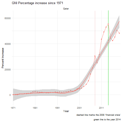
WOW! ‘Something’ happened in about 2001, which led to exponential increases each year. Even Qatar didn’t escape the 2008 financial crises, nor the losses in 2015 (see above) - which occur the year after the highest GNI.
Getting Percent Increase Each Year
Hmmmm….
# gni_pct$percent %>%
#  mutate_all(funs(. - lag(.))) %>%
#  na.omit()

# gni_diff <- gni_pct %>%
#   group_by(CountryCode) %>%
#   mutate(diff = FrequencyLag(percent, default = first(percent)))
#   mutate(diff = percent = lag(percent))
#   summarise_at(vars(percent), diff)
#   mutate(diff = c(0, apply(gni_pct[6], 2, diff)))

# gni_diff <- gni_pct %>%
#  mutate(
#    diff = ave(
#      percent,
#      factor(CountryCode),
#      FUN = function(x) c(NA, diff(x))


#   filter(CountryCode %in% countries) %>%
#   ggplot(aes(year, diff, group = CountryCode, colour = CountryCode)) +
#   geom_vline(xintercept = "2008", colour = "red3", size = 0.1) +
#   geom_line(stat = "identity") +
#   geom_point() +
#   geom_smooth(method = "loess") +
#   facet_wrap(~CountryName, scales = "free") +
#   scale_x_discrete(breaks = seq(1971, 2021, 10)) +
#   # scale_y_log10() +
#   labs(
#     title = "GNI Percentage increase since 1971",
#     subsitle = "percent increase in GNI, since the previous year",
#     x = "Year",
#     y = "Percent Increase (log10)",
#     caption = "vertical line marks the 2008 'financial crisis'"
#   ) +
#   theme(legend.position = "none")
Gosh - We Need a Map!
Normally, you may want to take population into account when displaying the “value” of a country. I don’t intend to do that here, so this is one of many, many approaches that could be used to demonstrate the distribution of wealth around the world.
Randomly, I’m selecting 2019 data. Most countries should have a value (for the interested reader to confirm if this is true!); and the value will not be impacted by the Covid-19 global epidemic.
Arrange World Data and Create Map Data
world_map <- map_data(map = "world")
world_map$region <- iso.alpha(world_map$region)

gni_map <- gni %>%
  filter(year == 2019) %>%
  mutate(
    iso2 = countrycode(CountryCode, origin = "iso3c", destination = "iso2c")
  ) %>%
  na.omit()

gni_map %>%
  filter(iso2 == "NA") %>%
  distinct(CountryCode)
## # A tibble: 1 x 1
## CountryCode
## <chr>
## 1 NAM# Namibia's code is "NA" - load it properly (not being R's NA)
gni_map$iso2[gni_map$CountryCode == "NAM"] <- "<NA>"In this code, we obtain a range (I’m sure this can be done ‘automatically’, but enough for now!). Dividing into 8 groups, each group has 28/9 countries - each being within the same range of GNI. On another project, we could first remove the regions (groups of countries) that are in the data, which may skew the result…
We manually create the list of breaks and labels, based on the result.
table(cut2(gni_map$gni, g = 9))##
## [6.53e+07,2.30e+09) [2.30e+09,7.84e+09) [7.84e+09,1.50e+10) [1.50e+10,2.46e+10)
## 21 20 20 20
## [2.46e+10,5.27e+10) [5.27e+10,9.53e+10) [9.53e+10,2.92e+11) [2.92e+11,7.17e+11)
## 20 20 20 20
## [7.17e+11,2.17e+13]
## 20gni_map$range <- cut(
gni_map$gni,
breaks = c(
0, 2.30e9,
7.84e9, 1.5e10,
2.46e10, 5.27e10,
9.53e10, 2.92e11,
7.17e11, 2.17e13
),
labels = c(
"Under 2.30", "2.30 - 7.84",
"7.84 - 15.0", "15.0 - 24.0",
"24.0 - 52.7", "52.7 - 95.3",
"95.3 - 292", "292 - 717",
"Over 717"
)
)… 9 groups, because that is the max number of colours in the brewer sequential colour palette!
Plot the World
world <- gni_map %>%
  ggplot() +
  geom_map(aes(map_id = iso2, fill = (range)), map = world_map) +
  geom_polygon(
    data = world_map, aes(
      x = long,
      y = lat,
      group = group
    ),
    colour = "black",
    fill = NA
  ) +
  scale_fill_manual(
    name = "GNI Range ($000,000,000)",
    values = (brewer.pal(9, name = "Reds"))
  ) +
  theme_void() +
  theme(legend.position = "bottom") +
  labs(
    title = "World map of GNI in 2019",
    subtitle = "current USD ($) all values in billion dollars\n"
  )

world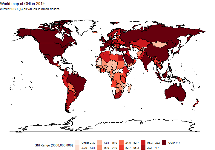
Zoom in to Europe
world +
  scale_x_continuous(limits = c(-13, 40), expand = c(0, 0)) +
  scale_y_continuous(limits = c(33, 73), expand = c(0, 0)) +
  labs(title = "Europe map of GNI in 2019")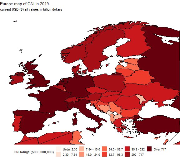
It is probably no surprise that North America, much of Europe and Asia are all in the top 2 groups of GNI.
For some, this is the sheer size of the country, but individuals in less populated countries actually have higher wealth.
Conclusion
Much more to do.
Many more places to go.
This has been great learning for R, but perhaps I should write more conclusions!!