Covid 19 Charts
Playing with UK Covid data
The source of all data in this script is the UK Government website, https://coronavirus.data.gov.uk/.
Now we can get a summary of the cases data:
summary(cases)## areaCode areaName areaType date
## Length:180605 Length:180605 Length:180605 Min. :2020-01-30
## Class :character Class :character Class :character 1st Qu.:2020-07-04
## Mode :character Mode :character Mode :character Median :2020-10-31
## Mean :2020-10-30
## 3rd Qu.:2021-02-27
## Max. :2021-06-25
##
## newCasesBySpecimenDate newDeaths28DaysByDeathDate
## Min. : 0.00 Min. : 0.000
## 1st Qu.: 2.00 1st Qu.: 0.000
## Median : 7.00 Median : 0.000
## Mean : 25.82 Mean : 0.737
## 3rd Qu.: 25.00 3rd Qu.: 1.000
## Max. :1701.00 Max. :38.000
## NA's :19 NA's :15384This shows that we have 162382 observations, with a dates between 2020-01-30 and 2021-06-25.
Wrangling the Data
To aide simplicity, we first choose a selected number of areas for data to compare and wrangle the data slightly to provide what we’‘ll be needing.
selected <- cases %>%
  filter(areaName %in% c("Crawley", "Mid Sussex", "Horsham")) %>%
  select(areaName, date, newCasesBySpecimenDate, newDeaths28DaysByDeathDate) %>%
  mutate(
    cases7 = rollmean(newCasesBySpecimenDate, 7, na.pad = TRUE),
    deaths7 = rollmean(newDeaths28DaysByDeathDate, 7, na.pad = TRUE)
)- Filter our areas. Just for local interest in this overview, we will look at Crawley, Horsham and Mid Sussex.
- Select the columns we are interested in.
- Mutate the data to add columns for 7-day Rolling Average of cases and deaths.
Crudely Plot our Data
Using the 7 day rolling average, to avoid a jagged chart, we show deaths and cases.
selected %>%
  ggplot(aes(date, deaths7, colour = areaName)) +
  geom_line(na.rm = TRUE) +
  labs(y = "# Deaths (7 day rolling average)", x = "Death Date")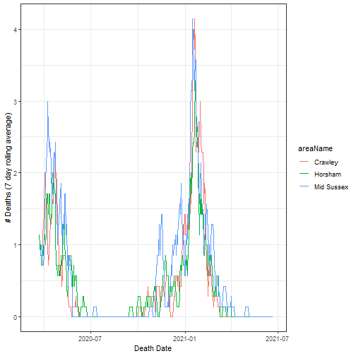
The Death Date is the date of death, given that they had Covid-19 within the past 28 days.
selected %>%
  ggplot(aes(date, cases7, colour = areaName)) +
  geom_line()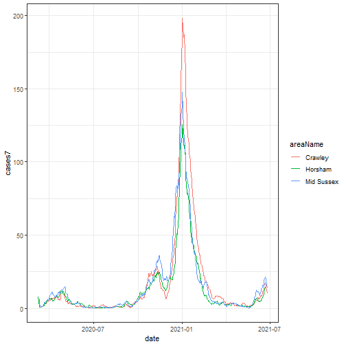
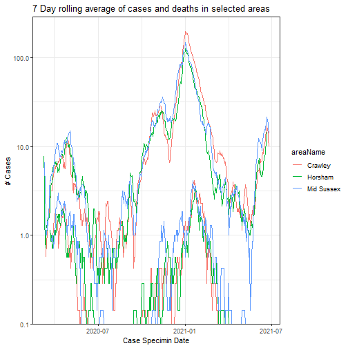
Chart for Cases and Deaths
Not the best way to display this data, but it shows the number of cases at a given time, and how the death rates followed the cases.
selected %>%
  ggplot(aes(date, newCasesBySpecimenDate, colour = areaName)) +
  geom_line(aes(y = cases7)) +
  geom_line(aes(y = deaths7)) +
  scale_y_log10() +
  labs(
    y = "# Cases", x = "Case Specimin Date",
    title = "7 Day rolling average of cases and deaths in selected areas"
  )
A boxplot with jitter to show the ‘range’ of data. Notice that each area have a similar mean and quartile data. Also that even the outliers are similar.
selected %>%
  ggplot(aes(areaName, newCasesBySpecimenDate, colour = areaName)) +
  geom_boxplot(outlier.shape = NA) +
  labs(y = "# Cases", x = "Area", title = "Cases in selected areas") +
  geom_jitter(width = 0.3, alpha = 0.4, stroke = 0)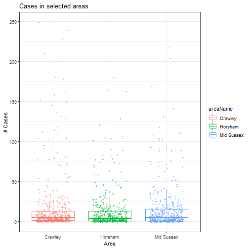
Maybe a better way would be to facet this data. Unfortunately, at the moment, our data is not truely ‘tidy’. In order to facet wrap, we need to tidy the cases7 and deaths7 columns.
“Tidy” data follows these rules:
- Each variable in the data set is placed in its own column
- Each observation is placed in its own row
- Each value is placed in its own cell
https://garrettgman.github.io/tidying
Oh. We need to turn
| areaName | cases | deaths |
|---|---|---|
| X | 10 | 6 |
into
| areaName | ra7 | count_type |
|---|---|---|
| X | 10 | cases |
| X | 6 | deaths |
so that each row provides us with a single observation.
We use pivot_longer to create columns ra7 and count_type and populate it with death/case values and detail the data type.
tidy <- selected %>%
  select(-newCasesBySpecimenDate, -newDeaths28DaysByDeathDate) %>%
  pivot_longer(c(cases7, deaths7), names_to = "count_type", values_to = "ra7")
tidy %>%
ggplot(aes(date, ra7, colour = areaName)) +
geom_line(na.rm = TRUE) +
facet_wrap(~count_type) +
geom_smooth(method = loess) +
scale_y_continuous(trans = "log10") +
labs(
y = "# Cases", x = "Case Specimin Date",
title = "7 Day rolling average of cases and deaths in selected areas"
)## `geom_smooth()` using formula 'y ~ x'
Sum Across the UK
Just for fun, join everything together and sum cases across the UK…
cases %>%
  mutate(cases = rollmean(newCasesBySpecimenDate, 7, na.pad = TRUE)) %>%
  group_by(date) %>%
  summarise(sum_cases = sum(cases, na.rm = TRUE)) %>%
  ggplot(aes(date, sum_cases)) +
  geom_line() +
  scale_y_log10() +
  labs(
    y = "# Cases", x = "Case Specimin Date",
    title = "7 day RA of positive cases in the UK"
  )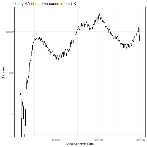
Using a logarithmic scale, we can clearly see just how high cases are still - and how quickly it took hold in March / April 2020.
Summary
There are so many (better and correct) ways to present this data. These charts are just a tiny amount of fun for my first ‘used in anger’ R script.