Covid-19 Heatmaps
Let’s Plot Covid-19 in the UK…
Source
Covid-19
Covid data is from the UK Government website, using the following URL:
Covid-19 data is CONFIRMED cases or deaths only.
- A case is registered on the date of the test specimen.
- A death is registered on the day of death, and the death occurs within 28 days of a positive Covid-19 test.
- The dates, especially more recent ones, are subject to change as data comes in.
Population
This data is sourced from the ONS website. It is from mid 2019, but good enough for our use.
Read and Select Required Data
source <- "https://api.coronavirus.data.gov.uk/v2/data?areaType=ltla&metric=newDeaths28DaysByDeathDate&metric=newCasesBySpecimenDate&format=csv"
src <- read_csv(source)[, c(1:2, 4:6)]

source_counties <- "http://geoportal1-ons.opendata.arcgis.com/datasets/89109c7ba29f496187e125b5c8a091b6_0.csv"
counties <- read_csv(source_counties)[, c(1, 4)]

source_population <- "../data/population-mid2019.xls"
population <- read_excel(
  source_population,
  sheet = "MYE2 - Persons",
  skip = 4
)[, c(1, 4)]

raw <- src %>%
  left_join(counties, by = c("areaCode" = "LTLA18CD")) %>%
  left_join(population, by = c("areaCode" = "Code"))

colnames(raw) <- c(
  "code", "name", "date", "cases",
  "deaths", "county", "population"
)
Tidy…
Create an R-tidy table for easier use within ggplot.
data <- raw %>%
  pivot_longer(c("cases", "deaths"), names_to = "type", values_to = "count")
data
## # A tibble: 366,530 x 7
## code name date county population type count
## <chr> <chr> <date> <chr> <dbl> <chr> <dbl>
## 1 E060000~ Redcar and Cleve~ 2021-07-02 Redcar and Clev~ 137150 cases 19
## 2 E060000~ Redcar and Cleve~ 2021-07-02 Redcar and Clev~ 137150 deat~ 0
## 3 E070000~ East Devon 2021-07-02 Devon 146284 cases 14
## 4 E070000~ East Devon 2021-07-02 Devon 146284 deat~ 0
## 5 E070000~ Havant 2021-07-02 Hampshire 126220 cases 10
## 6 E070000~ Havant 2021-07-02 Hampshire 126220 deat~ 0
## 7 E070002~ Surrey Heath 2021-07-02 Surrey 89305 cases 4
## 8 E070002~ Surrey Heath 2021-07-02 Surrey 89305 deat~ 0
## 9 E070002~ Worthing 2021-07-02 West Sussex 110570 cases 7
## 10 E070002~ Worthing 2021-07-02 West Sussex 110570 deat~ 0
## # ... with 366,520 more rowsFor simplicity, split the data into cases and deaths.
Add some helper columns to each dataset.
Convert case and death counts to a rolling 7-day average.
cases <- subset(data, type == "cases")
deaths <- subset(data, type == "deaths")

cases_heatmap <- cases %>%
  arrange(code, date) %>%
  na.omit() %>%
  group_by(code) %>%
  mutate(
    max_count = max(count, na.rm = TRUE),
    max_date = date[which(count == max_count)][1],
    count7 = rollmean(count, 7, na.pad = TRUE),
    prop_max = count / max_count,
    per_ht = as.integer(count7 * 100000 / population),
    total = sum(count, na.rm = TRUE),
    total_per_ht = as.integer(total * 100000 / population)
  ) %>%
  ungroup()

deaths_heatmap <- deaths %>%
  arrange(code, date) %>%
  na.omit() %>%
  group_by(code) %>%
  mutate(
    max_count = max(count, na.rm = TRUE),
    max_date = date[which(count == max_count)][1],
    count7 = rollmean(count, 7, na.pad = TRUE),
    prop_max = count / max_count,
    per_ht = as.integer(count7 * 100000 / population),
    total = sum(count, na.rm = TRUE),
    total_per_ht = as.integer(total * 100000 / population)
  ) %>%
  ungroup()

min_date <- min(cases$date)
max_date <- max(cases$date)
Heatmap 7-day Rolling Average
If you zoom in with your browser, you should just about be able to read the axes.
Total cases for 7-day rolling average.
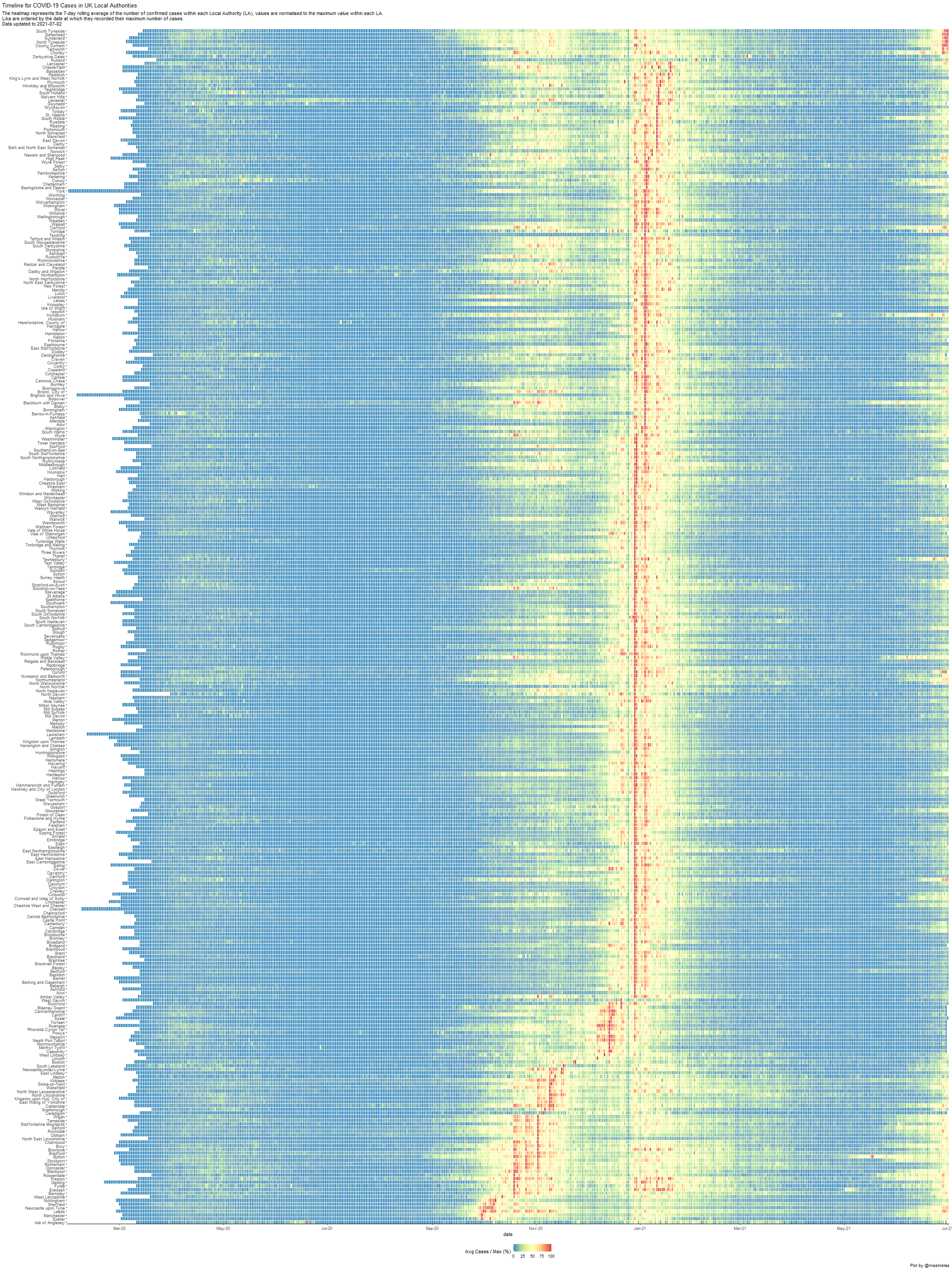
Each LA has its number of cases normalised to its own maximum number of cases. Therefore, each LA will have a red plot signifying the day of maximum cases.
This way, it is easy to spot the first, second, and the third waves (just beginning).
Some (very brief) interesting things:
- some of the LAs with later maximum case dates (at the top), are seeing very high rates in the 3rd wave (proportionally)
- the early starters in the first wave are also starting early in the third
- there are a number of LAs (those who saw the earliest cases) who had large waves in both October / November AND January
I like this plot, as it aditionally shows clear information on where the cases began in the UK.
Introduce population
This similar heatmap presents the number of cases per 100,000 population within each Local Authority. As before, LAs are ordered by the date a which they recorded their maximum number of cases.
On the right is a plot of the total number of cases recorded for that LA.
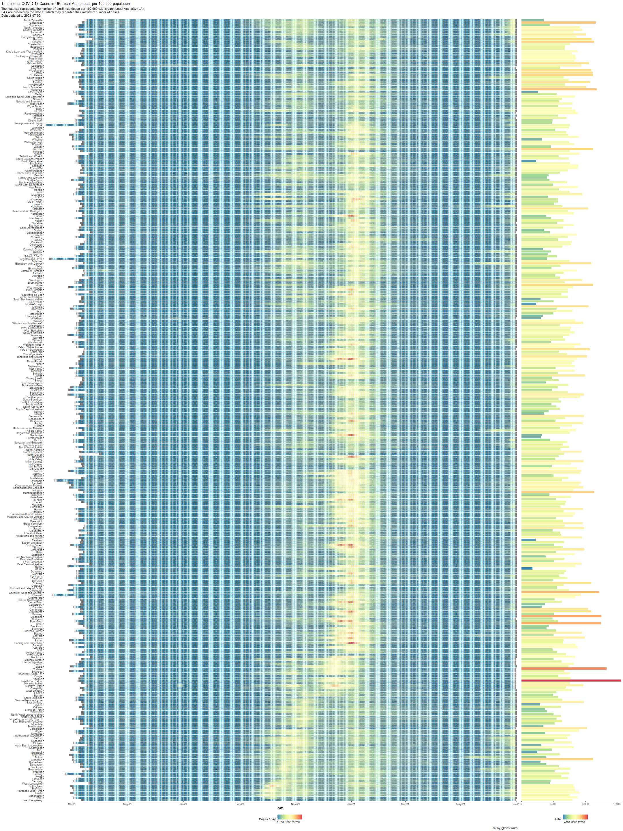
The general pattern is the same as above. It is less easy to see the first wave, but more easy to identify the regions with the higher number of cases.
Deaths
As for cases above, the number of deaths is normalised to the maximum of deaths recorded for each LA.
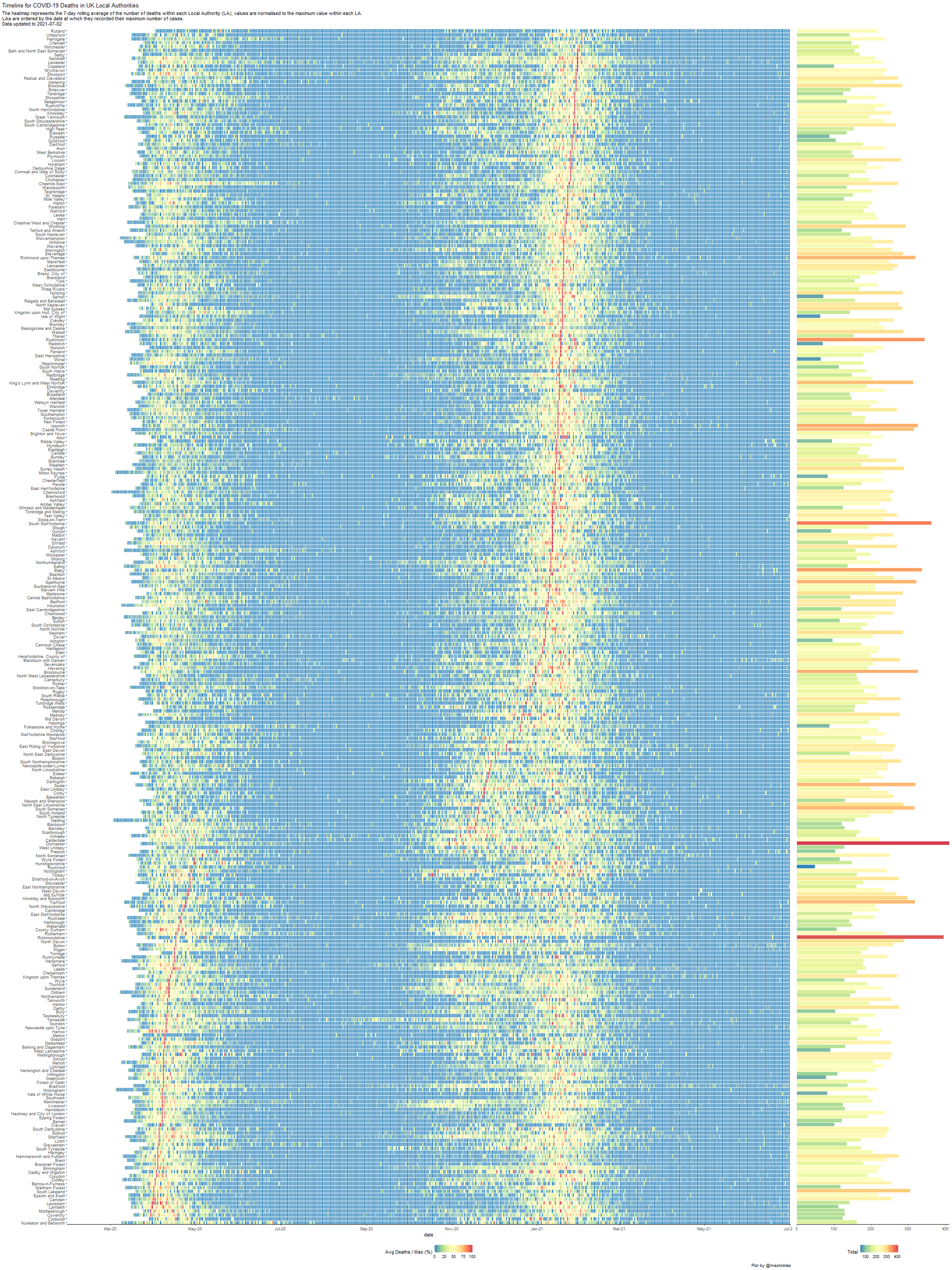
The minimum plot date (and the max) is the same as for cases, so it is possible to see the delay in deaths since the cases.
LAs are ordered differently as those of cases. I am in no position to speculate why at this time!
I can see an interesting split in this death data… LAs who had high daily deaths in the first wave, had lower in the second; but those with fewer in the first suffered badly in the second. Ordering by date of highest daily count does not present any correlation with total number of deaths.